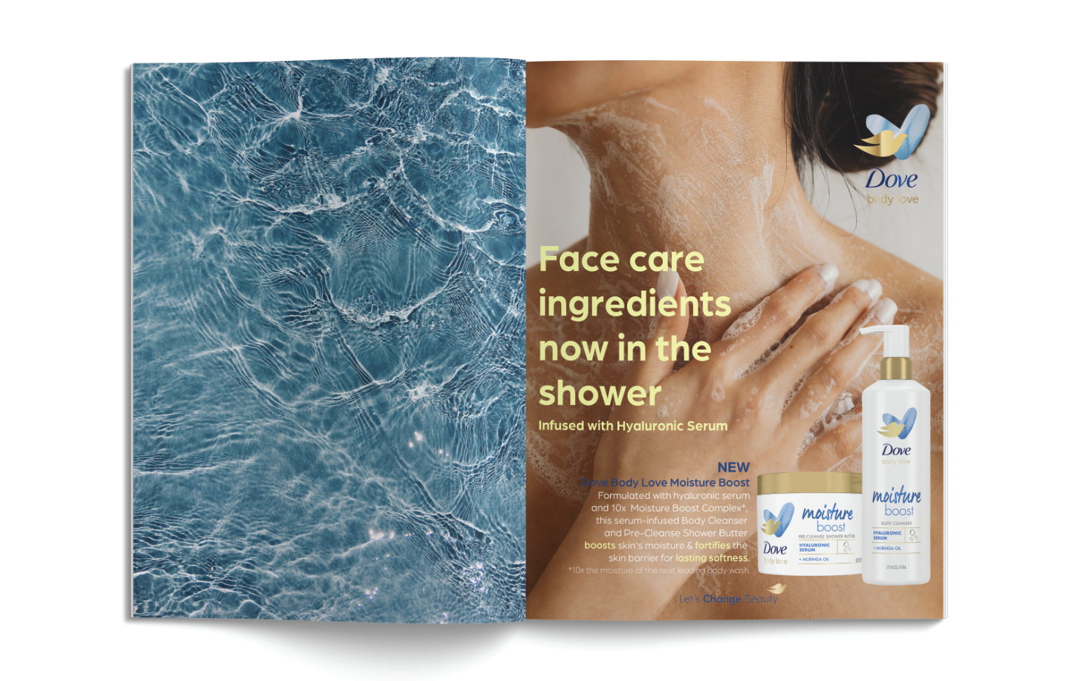
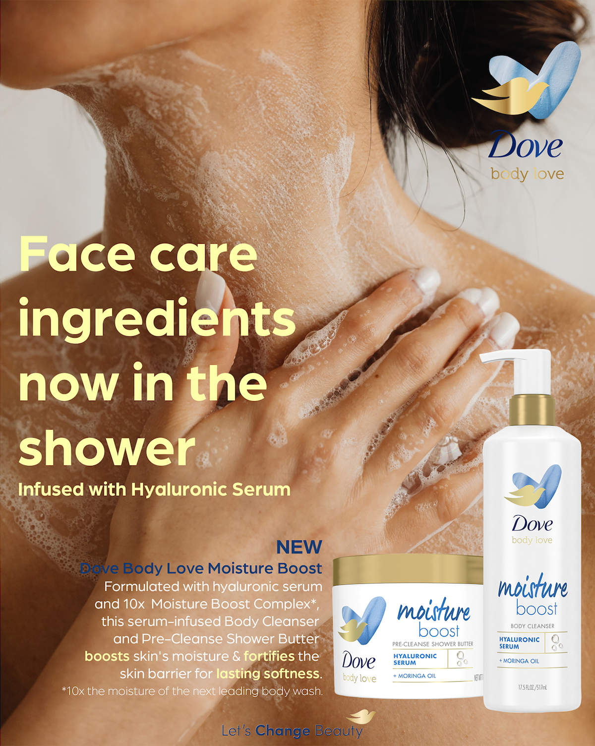
For my Dove Magazine ad I wanted to stay true to the Dove brand while also giving it a little bit of a face lift. I wanted it to appeal to a younger audience around early 20s because that age group are big fans of skincare and are driven to buying products that will make them feel good. For imagery I used an aesthetic close up photo of a women with manicured nails using body wash. She looks luxurious, clean, and while you can’t see her face she has positive body language and looks happy to be using the product. For the text, I thought the pale yellow bold type would capture the attention of the audience and thought the yellow contrasted nicely with the brand’s traditional blue. For the body text I bolded the action words and changed the color so the viewer could quickly understand what the product would do without having to read everything if they didn’t want to.
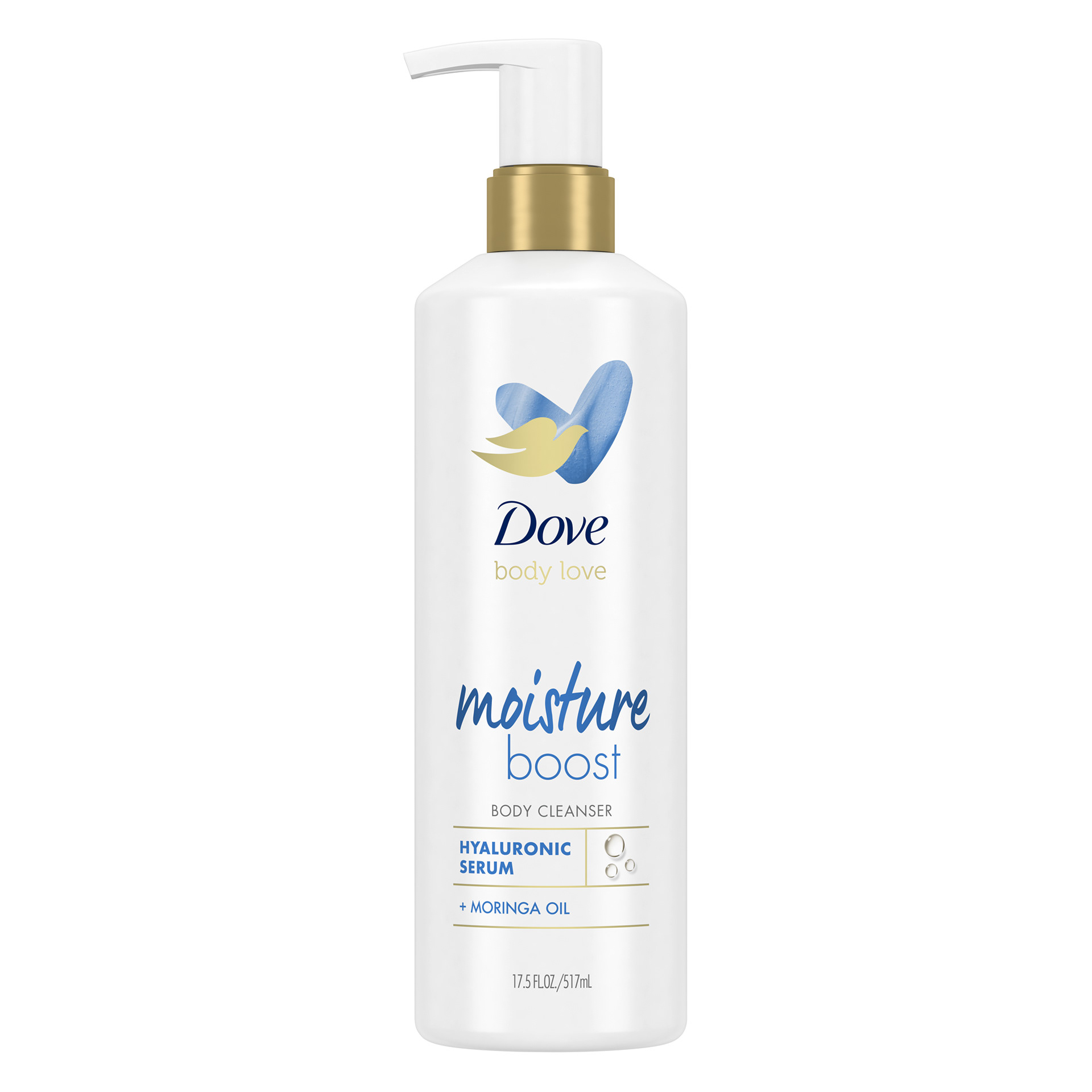
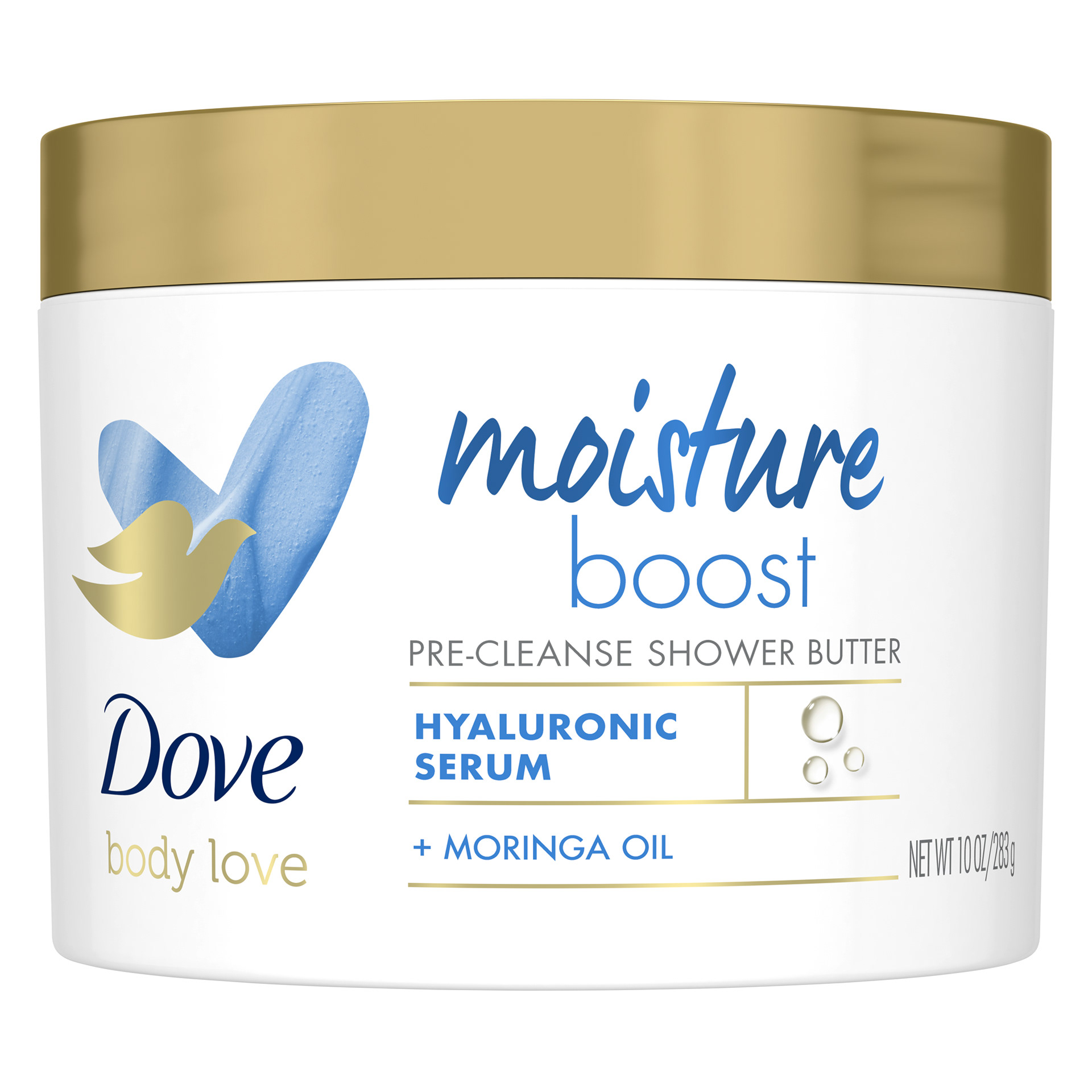
Dove Graphics Used